x
Many people feel they “aren’t artistic,” yet still crave a way to communicate ideas more boldly and clearly. With the right foundation, colours gain purpose, fonts gain personality, and simple layouts suddenly feel polished.
Graphic design shows up everywhere in daily life, even when you barely notice it. From the logo on your coffee cup to the layout of your favourite site, someone made visual choices that quietly guide what you feel and where you click.
For beginners, it helps to see design as communication, not decoration. A logo uses colour, shape, and typography to say what a brand stands for in a split second. The same idea applies to app icons, posters, or a transit ad: clear hierarchy tells your eyes what to read first, while balance keeps everything feeling stable and easy to scan. When these basics work, people understand information faster and feel more comfortable, even if they never think about “design” at all.
| Everyday situation | What design is doing in the background | How a beginner can practise with it |
|---|---|---|
| Buying coffee | Logo and packaging signal mood and price level | Redesign a cup and logo that match a different brand personality |
| Using a phone app | Icons, colours, and spacing guide quick taps and decisions | Simplify an app home screen to make one action clearly primary |
| Reading posters | Type size and layout decide what you notice while walking past | Create a poster that must be understood in three seconds |
| On public transit | Symbols and maps reduce confusion in a crowded environment | Redraw a metro map section with clearer hierarchy and labels |
Online, graphic design merges with usability and accessibility. A web page layout decides whether someone finds a button, reads a headline, or just gives up. Beginners can start by planning simple grids, choosing readable fonts, and limiting colours so pages feel consistent from one screen to the next. Rhythm in spacing, repeated styles, and well-placed emphasis make an interface feel intentional. Practising these principles on small projects—like a personal site or portfolio—helps turn early logo sketches and rough mockups into work that looks and feels professional.
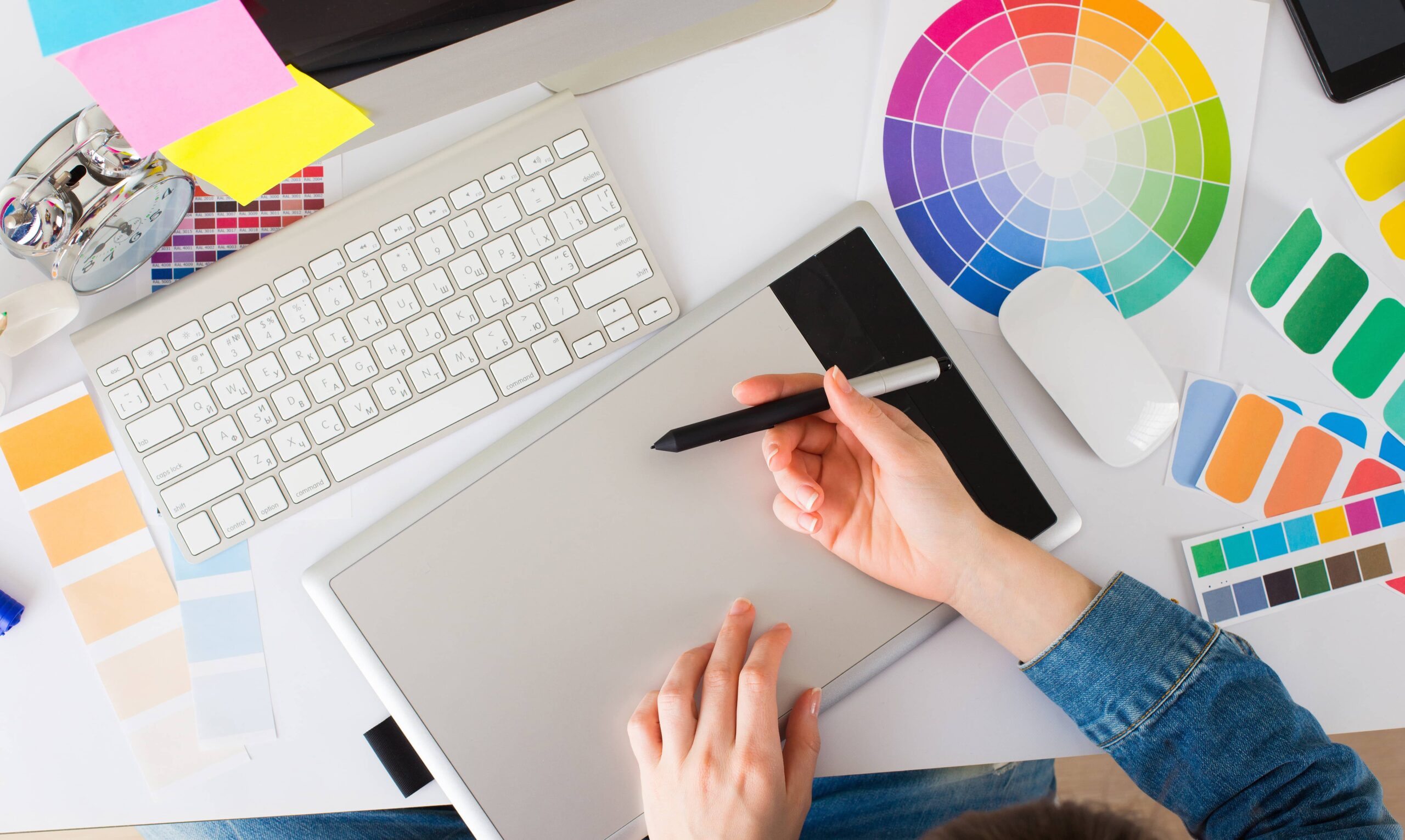
Getting into graphic design can feel overwhelming, but a few core ideas about color, type, and layout will quickly make your work look more intentional. Once you understand how these pieces work together, it becomes much easier to move from rough experiments to work you’re proud to share.
Start by matching color mode to where your design will live: RGB for screens, CMYK for print, LAB when you need really precise, perception-based tweaks, and simple index or bitmap files when you care more about small, web‑friendly sizes. For choosing colors, the 60-30-10 rule is a lifesaver: one main color for most of the design, a second to support it, and a small accent for pop. Play with complementary or triadic schemes, then test ideas in grayscale and check contrast so text stays readable and your design feels accessible for more people.
Good layout is mostly about clear hierarchy and contrast. Make the most important message the largest or boldest, then step down in size and weight so the eye knows where to go first, second, and third. Use no more than two or three typefaces, and let size, weight, and spacing create variety instead of grabbing random fonts. Contrast can come from color, lightness, size, or shape, but keep it consistent across your project so everything feels related. When color, type, and layout work together, even a beginner portfolio starts to look clean, coherent, and professional.
Starting graphic design can feel overwhelming, especially when you are choosing between free videos, short workshops, and big paid programs. The goal is not just “learning tools,” but getting from your first logo to a real portfolio that could support freelance work or a new job.
Free resources are great for testing the waters. Short online intros or “In a Day” style virtual classes on Photoshop or Illustrator let you see if you enjoy design without a big commitment. This works well if you are balancing school, a full‑time job, or parenting and just want to learn at your own pace. Many beginners in smaller towns or remote areas also rely on free or low‑cost online lessons because local options are limited. The trade‑off is structure: you may learn tools, but not necessarily how to build a coherent portfolio or follow a clear path toward paid projects.
Paid courses start to matter when you want results faster and need guidance. An 84‑hour beginner‑friendly graphic design certificate with mentoring, financing options, and a focus on Adobe tools can push you from casual learner to someone ready to show work to clients. Live online bootcamps on Zoom give flexibility if you move around a lot, while evening or weekend classes fit around a regular job. In‑person sessions add access to professional equipment for hands‑on learners. Many newcomers now look less at price and more at outcomes: strong portfolios, confidence with software, and a direct route into mid‑income design roles through structured, self‑paced subscriptions and hybrid learning models.
Getting into graphic design can feel huge, but your first poster and your first portfolio do not need to be perfect. They just need to show that you think like a designer, make clear decisions, and care about how people experience your work online.
Start with small, realistic projects: a gig poster, a café menu, a simple social post series. Focus on contrast, alignment, and spacing before fancy effects. When you are ready to collect work, avoid throwing everything in. A focused selection instantly feels more confident.
Strong beginner portfolios usually feel edited and intentional: each project has a role, the overall look is consistent, and visitors can understand your thinking with minimal effort. Instead of chasing trendy effects, it helps to show clear before‑and‑after moments, simple mockups in real‑world contexts, and short explanations of how you solved a specific problem for a user or client—even if the project is self‑initiated.
Most beginners either over-decorate or under-explain. A simple checklist keeps you on track and nudges you toward the kind of work you want to be hired for, whether that is branding, social content, or product UI.
New designers who stand out online often do a few things consistently: they write honest notes about what they would improve next time, they show process sketches instead of only final images, and they keep updating older projects as their skills grow. Over time, this turns a basic portfolio into a living record of your design decisions, not just a gallery of pictures.
Q1: What core principle makes graphic design more than just decoration?
A1: Graphic design is visual communication. It uses colour, shape, type, hierarchy, and balance to guide attention and feelings so people quickly understand messages and navigate information.
Q2: Why is hierarchy so important in both posters and web pages?
A2: Hierarchy tells the eye what to read first, second, and third. Clear size, weight, and positioning help viewers scan quickly and avoid confusion or frustration.
Q3: Which color modes should beginners use for different design outputs?
A3: Use RGB for screen designs, CMYK for printed work, LAB for very precise colour tweaks, and index or bitmap modes when you need very small, web‑friendly file sizes.
Q4: What basic tools and choices shape a beginner‑friendly web layout?
A4: Simple grids, readable fonts, limited colour palettes, consistent spacing, and repeated styles create rhythm, clarity, and an accessible, professional feel across pages.
Q5: How can beginners explore and combine different design styles effectively?
A5: Test complementary or triadic colour schemes, limit yourself to two or three typefaces, and use consistent contrast, spacing, and emphasis to keep varied styles feeling coherent.